Context
VoiceXD is a collaborative platform that allows teams to build, test, and publish conversational AI agents (chatbots) without writing code.
 VoiceXD demo (Created using Rive)
The Problem
While VoiceXD made building chatbots easy, debugging them was painful. When a bot failed in testing, designers had to scroll through endless, unstructured chat logs or parse complex JSON payloads to understand what went wrong. They lacked the tools to identify why a conversation broke down or how to fix it and there was no easy way to visualize the logic behind the bot's responses.
The Opportunity
To position VoiceXD as an enterprise-grade platform, we needed to move beyond creation tools and build a feature that would turn raw conversation data into actionable insights, utilizing the (then-new) capabilities of Large Language Models (LLMs).
My core objectives were to:
- Reduce Cognitive Load: Transform raw JSON logs into a human-readable format.
- Enable AI-Powered Debugging: Leverage AI to pinpoint where conversations broke down and provide actionable insights.
- Ensure Scalability: Design a system that could handle thousands of message turns without breaking the UI or the backend.
Discovery and Insights
I conducted a competitive audit of platforms in the conversation design space, talked to our early users and partnered with our internal Subject Matter Experts (SMEs) in Conversation Design to audit their existing workflows for debugging.
I identified that users traverse two distinct mental modes when reviewing transcripts:
-
The "Reader" Mode: They read the chat linearly like a script to understand the user's sentiment, flow, and frustration.
-
The "Engineer" Mode: They need to see the exact variable state, API status (200/404), and slot-filling logic at every turn.
Key Insight 1: We couldn't just choose simplicity or complexity. Users needed both. They needed a way to toggle between "Human Readability" and "Machine Logic" instantly within the conversation view.
Key Insight 2: Other platforms focused on a basic fundamental transcript management like browsing, categorizing, and managing statuses of transcripts, and lacked advanced analytical and debugging capabilities.

Exploring Possible Solutions
The most ambitious part of this project was the AI analysis feature, which leverages AI to critique conversations (e.g., "Why did the user get frustrated here?"), identify root causes, and provide actionable insights.
My initial idea was to incorporate this feature into a sidebar, allowing users to run analysis on the entire transcript at once.

Problems with the Initial Design
During testing and engineering reviews we identified that this approach had a few limitations:
-
Users didn't want to analyze the whole chat; they usually cared about a specific failure point (e.g., "Why did the bot fail at step 4?").
-
During technical feasibility reviews with engineering, we identified a technical constraint related to the Context Window. We were using the OpenAI GPT-3.5-turbo-16k model with a context window of 16k tokens. Thus, sending the entire conversation history would exceed the 16k token limit, causing the feature to fail.

The Solution
I pivoted the interaction model from "Analyze All" to "Scoped Selection". I introduced a pattern where users select a specific range of messages (Start Point → End Point).

Why this design direction worked:
- Technical Feasibility: It ensured that the data sent to the LLM was always within token limits.
- Focused Debugging: Users can focus on a specific section of the conversation (e.g., "Why did the bot fail at step 4?"), making it easier to identify the root cause of the issue.
- Reduced Cognitive Load: By analyzing a smaller subset of the conversation, users can avoid getting overwhelmed by too much information.
Reaching this solution required multiple iterations and close collaboration with our engineering team. Through this process, I identified technical constraints and refined the design until we landed on an approach that was both technically viable and delivered excellent user experience. Here are the key iterations from that journey:
 Iteration and Feedback - Example 1
 Iteration and Feedback - Example 2
Shipped Designs
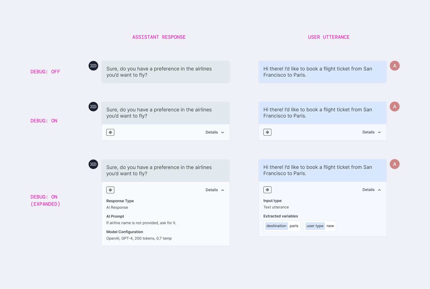
1) A "Debug Mode" toggle
Introduced to reduce the information on the screen and make it easier for users to toggle between a detailed and a simple view when needed.
-
Toggle Off: The interface looks like a standard messenger - clean and readable.
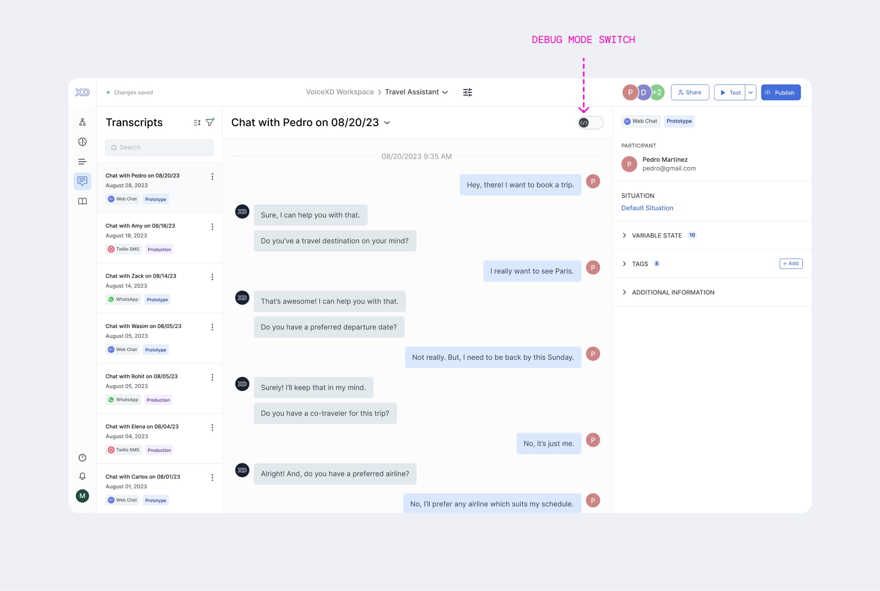
-
Toggle On: Every message bubble expands to reveal the backend details - input type, extracted variables (e.g.,
destination: paris), and intent classifiers.
2) Visual Indicators for Backend Processes
To help users visualize backend processes, I designed visual indicators to show the success/failure states for API calls directly within the chat stream.
 Backend processes (Before vs After)
 Backend process - API
3) Right Panel
To provide a better management of conversation transcripts, this panel allows users to view the extracted variables, assign tags to the transcript for easy categorization, and see additional metadata.

Key Outcomes
-
Successful Product Hunt launch: We successfully shipped the AI-powered debugging feature to 500+ users globally in late 2023. The launch was critical to our go-to-market strategy, anchoring our Product Hunt release where we achieved a #32 Day Rank.
-
Transformed complex data into user-friendly experience: By implementing progressive disclosure (via the Debug Toggle), I reduced the cognitive load of analysis. I successfully abstracted the complex backend data (e.g., API status, variable slots, etc.) into a user-friendly UI. This enabled 100% of our users to confidently debug and optimize assistants without needing engineering intervention to read logs.
-
Positive user sentiment:
Oh, I love this, I would say it's definitely a 5/5. It's a feature of other platforms (competitors) that I've wished had more to it
That debug toggle [Show Only Required Details] is brilliant!
Retrospective
While I had a long-standing interest in Conversation Design and had previously explored designing for it, getting hands-on with this project raised the bar on my learnings.
Constraints are important. The 16k token limit felt like a blocker, but it actually forced a better UX pattern (Scoped Selection) that made the tool more precise and useful for the end user.
How to navigate ambiguity? Develop well-defined and informed hypotheses, and then validate them early through in-depth conversations with users, engineers and stakeholders.